NEW YORK DATA CRIME
Project Topic Choice
The project is centered on an in-depth analysis of crime statistics in New York City. It aims to unravel the complexities and unique patterns in urban crime, focusing on various aspects such as geographical distribution, time-based trends, gender and more. This choice reflects an understanding of the importance of urban studies in criminology and the specific challenges faced by metropolises like New York City.
Exploration Questions
The project embarks on an in-depth analysis of New York City's crime statistics, raising important questions to show the complexities of urban crime. It poses inquiries such as: How do crime rates differ across the various boroughs? What unique patterns emerge from these geographical distinctions? The investigation also asks about time-based trends in crime: Are there discernible seasonal or yearly patterns? Is gender a big differentiator? Each question is tried to be answered through detailed graphical analyses, transforming data into a narrative that not only informs but also guides strategic approaches to urban safety and policy-making in New York City.
Data Journey
Our Exploration Path:
In the realm of data, every chart tells a story, and every insight uncovers a fragment of a larger narrative. Our journey began with a compilation of data sources, ensuring the information was accurate and up-to-date. We delved into the heart of New York's data repositories, extracting crime statistics that span boroughs, demographics, and time.
We cleaned and structured vast datasets, since our data was too big, We had to divide it by 50 so we had manageable data and also got rid of some columns of the data frame. Our tools were precision and patience as we sifted through data points, recognizing patterns and identifying anomalies. The visualizations you see are the culmination of this process: data refined into clarity and insight.
The Road to Insights:
Our visualizations are designed to offer a lens into the complexities of crime data in New York. From borough-specific crime counts to the gender distribution of victims and perpetrators, each graphic is a distilled version of a much larger dataset. These visualizations aim to provide a clear and immediate understanding of the data, allowing for quick comprehension and further inquiry.
Learning:
Data, however, is more than just numbers—it's a reflection of society. As we analyzed the datasets, we learned not just about the prevalence of crime, but also about the communities it affects and the patterns it follows. Our analysis revealed disparities and trends that prompt discussions on societal issues, law enforcement policies, and community safety initiatives.
Caveats
Data Limitations:
While we strive for accuracy, we acknowledge that our visualizations are limited by the data itself. Not all crimes are reported, and not all reports make it into the dataset, also knowing we had to cut our data. The figures presented should be viewed as indicative rather than definitive. They provide a glimpse into the broader context of crime in New York, though they cannot capture every nuance.
Interpretation:
The interpretation of data is subjective. We try to present our visualizations without bias, but the conclusions drawn from them will vary among viewers. We encourage users to consider the context and to understand that data is a tool for inquiry, not an end in itself.
Continuing the Conversation:
Data is constantly evolving, as is our understanding of it. We consider this website a starting point for a deeper conversation about crime, its causes, and its impact. We invite you to engage with the data, ask questions, and contribute to the ongoing dialogue about crime and prevention in our communities.
VISUALIZATIONS
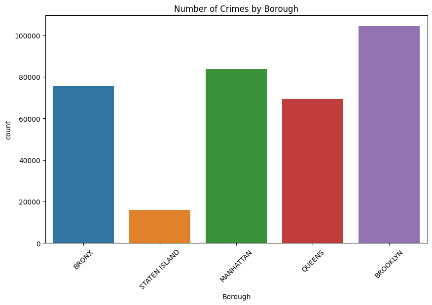
Visualization 1: Number of Crimes by Borough
- Findings: This visualization clearly shows the number of crimes in New York divided into the 5 boroughs of New York.
- Outliers: The data shows two main outliers in the data (Brooklyn and Staten Island) which would represent the most dangerous and safest borough in New York while the other 3 boroughs have a more consistent rate of crime among them.
- Population Density and Crime: The correlation between population density and crime rates is evident, particularly in Brooklyn.
- Possible Changes: The data highlights the need for a bigger police force in boroughs like Brooklyn, having the crime controlled in a place like Staten Island could free some of its force to be redirected to Brooklyn.
- Police Count per Borough: This visualization could lead us to look into the number of precincts in each borough and find a correlation between this number and the amount of crimes.
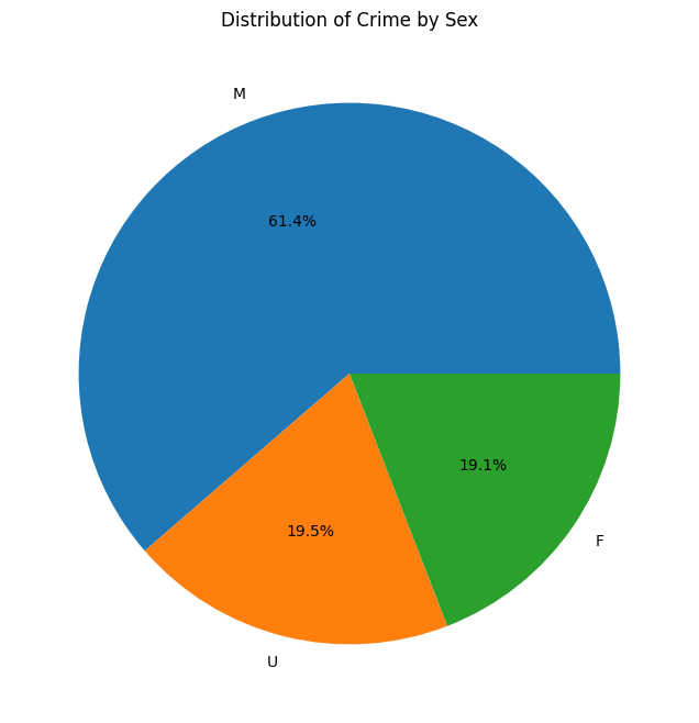
Visualization 2: Distribution of Crime by Sex (Perpetrators)
- Gender Disparity in Perpetrators: Males constitute a higher proportion of crime perpetrators, indicating possible gender-specific patterns in criminal behavior that could be related to higher levels of financial need or homelessness.
- Implications for Gender Studies: This disparity may provide valuable insights for sociological and psychological studies focused on gender and crime, contributing to finding a concrete explanation for the disparity.
- Crime Prevention Strategies: The data suggests a need for targeted crime prevention programs addressing male criminal behavior.
- Societal Impact: The findings highlight broader societal issues related to gender and crime, warranting further investigation and intervention.
- Biological Inclination: The data could lead researchers to look for a specific factor or factors in order to explain the humongous disparity between the amount sexes.
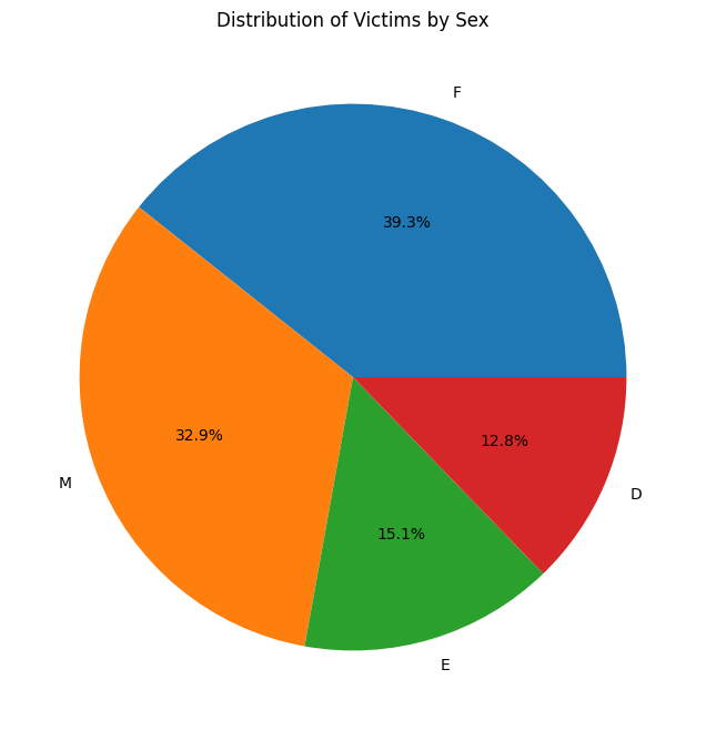
Visualization 3: Distribution of Victims by Sex
- Legend: D=Business/Organization E=PSNY/People of the State of New York F=Female M=Male
- Victim Equality: There is only a small difference between females and males in rewards to being victims of a crime.
- Identification: Only about 30% of the perpetrators are assigned as part of an organization or the state of New York.
- Need for Victim Support Services: This trend highlights the importance of providing adequate support services for female victims, given their higher victim rates.
- Implications for Community Safety: The data calls for community safety initiatives focused on protecting vulnerable groups, especially women.
Visualization 4: High Frequency of Felonies in Brooklyn
- High Frequency in Brooklyn: We can see how Brooklyn is the borough with the highest quantity on every level of offense.
- Misdemeanor in Bronx: We can see how in the Bronx in the Misdemeanor section, there is a high quantity compared to Bronx in the other level of offense.
- Safety in Staten Island: Following our data, it seems that Staten Island is the saftier borough.
- Specific law enforcement attention: This data can help understand what type of law enforcements are needed to reduce the counts on crimes.
- Aggresion: Misdemeanors are mostly happening in brooklyn closely followed by manhattan which due to its lower crime count might lead us to believe that the crimes commited there are commonly more aggressive.
Visualization 5: Correlation between Offense Level and Success Rates
- Offense Level and Success Rates: The heatmap reveals how different levels of offenses correlate with their success rates which is useful to know if there is effective law enforcement to stop the attempts of crime.
- Much lower attempted compared to completed: The data shows that almost all type of offenses are almost always completed and not just attempted.
- Resource Allocation and Strategic Planning: Insights from this visualization and results can guide strategic planning and resource allocation in crime prevention.
- Misdemeanor most completed: This graph shows how the misdemeanor is the most completed crime.
- Attempts: The low number of attempts may lead us to believe that most of the attempted crimes are either not reported or that the success rate of crime is high due to other factors like late police response.
Visualization 6: Temporal Trends in Crime Rates
- June 25, 2014: This graph shows that June 25, 2014 was the day with the highest crime number.
- Constant: We can see that across the years the number of crimes remain constant.
- Predictive Analysis for Future Crime Trends: Insights into past trends can aid in predicting and preparing for future crime scenarios.
- The patterns: This graph also shows patterns during the years, which can be helpful to analyze.
- Specificity: The slidebar in the bottom of the visualizations allows the user to zoom in to look for specific peaks in a year, month or week.
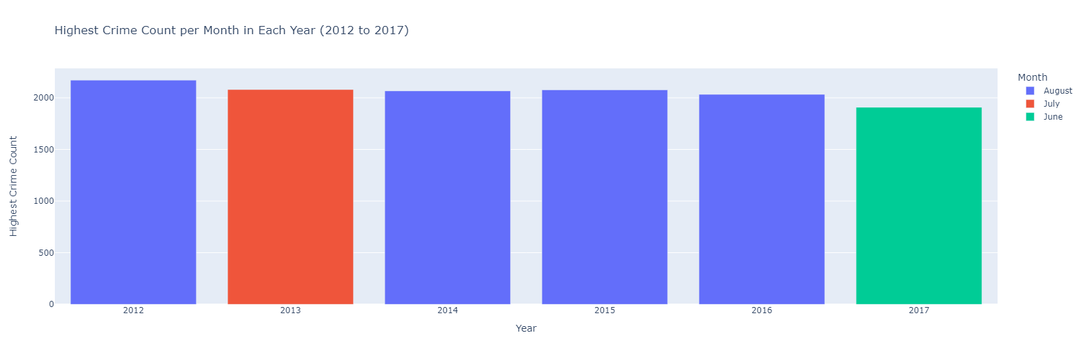
Visualization 7: Highest Crime Count per Month in Each Year (2012 to 2017)
- Highest month crime: We can see that 2012 is the year with the month with the highest crime.
- August the most: We can see how August is the month by far with more times appearing in the graph.
- Crime Prevention: Understanding the patterns, can help take measures to prevent crimes.
- Travel times: Results of the data can help people decide when to travel to New York, to find a safety month.
- Possible causes: Taking into account that most vacation periods end in august it is possible that the return from holiday may have something to do with the increase in crime.
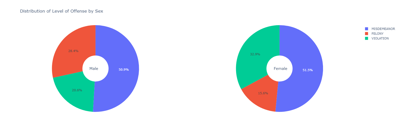
Visualization 8: Distribution of Level of Offense by Sex
- Males are predominantly more aggressive: Males have a higher felony rate which would lead us to believe that they are more aggressive and impulsive.
- Equal Misdemeanors: Even though as shown before women commit fewer crimes the percentage of misdemeanors is equal in both sexes.
- The Predominant Crime: Misdemeanors are the most common type of offense which gives some context to the level of danger in which New York is in.
- Different priorities: Violations are mostly committed by women which could be attributed to shoplifting, jaywalking, or traffic tickets.
- Proportion: Women only commit a third of the Misdemeanors made by men.
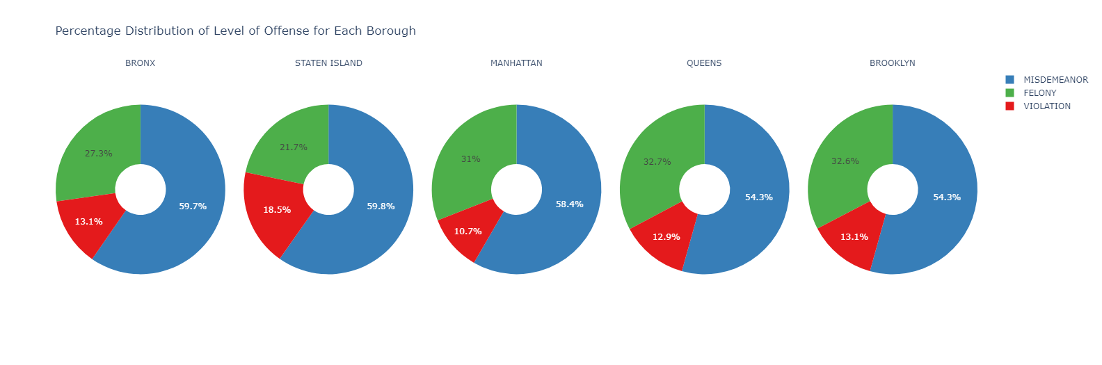
Visualization 9: Percentage Distribution of Level of Offense for Each Borough
- Danger by borough: The visualization clearly shows how some boroughs have much higher felony percentages which implies that Brooklyn, and Queens are the most dangerous boroughs.
- Staten Island: Being the borough with the least amount of crimes it is also the one with the lowest amount of felonies but the highest misdemeanors which would lead us to think that it is a place with a high robbery rate.
- Crime Prevention: Understanding the patterns, can help take measures to prevent crimes.
- Danger control: Queens and Brooklyn have the highest Felony rate, this percentage might lead us to believe that those areas are prone to having low to no control over low-profile crimes being more focused on felonies.
- Trends in crime: Most crimes committed are misdemeanors all around the 5 boroughs.
Conclusions and learnings
Conclusions
- Complex Urban Crime Landscape: The project's comprehensive analysis of New York City's crime statistics paints a picture of a complex and multifaceted urban crime landscape. The findings show significant disparities in crime rates across boroughs, with Brooklyn standing out for its particularly high rates, as well as a higher rate of male perpetrators which could be useful information to restructure the law enforcement system which could result in a safer city.
- Impact of Socio-Economic Factors: The research highlights the strong influence of socio-economic factors on crime patterns. Variations in crime across different boroughs suggest a correlation between socioeconomic conditions, population density, and crime rates throughout New York.
- Gender Dynamics in Crime: The project underscores a marked gender disparity in crime involvement. Males are predominantly the perpetrators, while females more often emerge as victims. This finding points to deeper societal patterns and vulnerabilities that need addressing.
- Importance of Tailored Strategies: The data calls for borough-specific approaches to crime prevention and law enforcement. The unique crime patterns in each borough require customized strategies, emphasizing the need for localized policy and resource allocation. A restructuring of the resources of New York could result in better management of crime without a major resource investment.
- Role of Community and Law Enforcement: There's a clear indication of the need for community-based programs and law enforcement strategies that are responsive to the distinct crime landscapes of each borough. This involves not just policing but also community engagement and support services, especially for vulnerable groups.
Learnings
- Data as a Reflection of Society: The analysis reveals that crime data is not just numbers but a mirror of societal issues, community health, and the effectiveness of law enforcement strategies. With this data, it is possible to create real change, capable of impacting thousands of lives.
- Continual Learning and Adaptation: The project demonstrates the dynamic nature of crime data and the need for ongoing analysis and adaptation of strategies. What works today might need adjustment tomorrow, emphasizing the need for continuous learning and evolution in crime prevention tactics.
- Value of Inclusive Dialogue: TThe findings encourage an inclusive dialogue involving various stakeholders—law enforcement, policymakers, community leaders, and residents. Understanding crime in its full context requires a collaborative effort.
- Need for Holistic Approaches:Addressing urban crime effectively demands a holistic approach that considers socio-economic factors, community dynamics, and targeted interventions. Law enforcement strategies should be complemented by socio-economic development and community support initiatives.
- Data Limitations and Responsible Interpretation: The project also teaches the importance of recognizing the limitations of data and the need for responsible interpretation. Data provides insights but should be viewed as a tool for inquiry and action, not an end in itself.